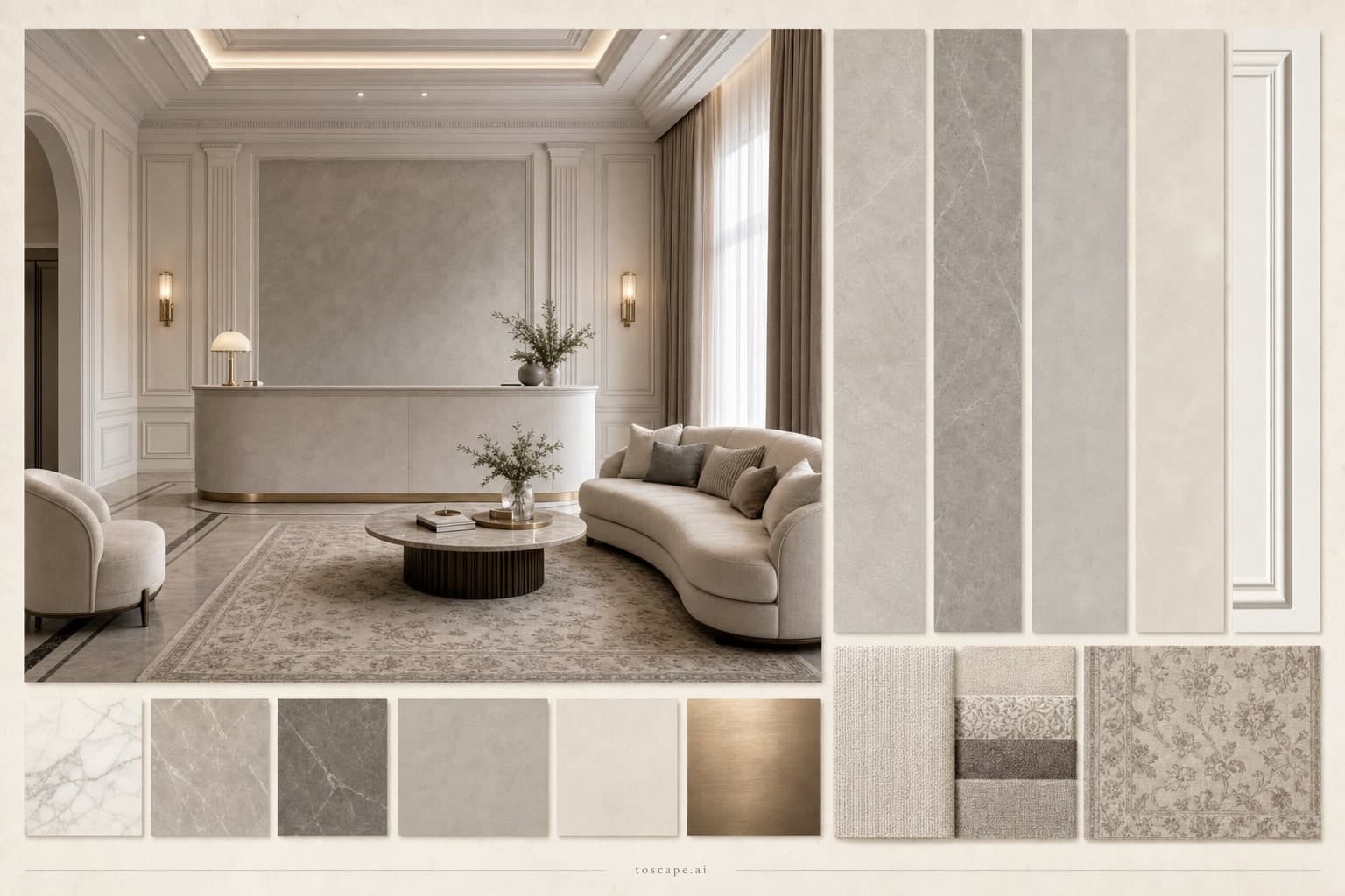
Neoclassic Cool Neutral Reception — Satin
Board 4509 · Variant 02 / Reception · Porcelain + Microcement
A neoclassic reception board in cool neutral stone gray and ash palette with satin surfaces, pairing porcelain and microcement on one poster.
Definition
Neoclassic Cool Neutral Reception — Satin is a neoclassic interior material moodboard for reception design — one poster pairing the rendered space with its exact surfaces, palette, textiles, and rug.
- Space
- Reception
- Style direction
- Neoclassic
- Palette
- Cool Neutral
- Finish
- Satin
- Surfaces
- Porcelain + Microcement
Overview
This board settles the material question for a reception area that makes the first impression. The grammar is neoclassic: paneled walls, symmetric composition, and restrained classical detailing kept at a residential scale. Large-format porcelain carries the main fields while microcement softens the transitions. Porcelain gives you a precise, low-porous surface for high-traffic zones; microcement wraps columns, splashbacks, and joints in one continuous skin, so the two materials meet without heavy trims. Across the board, the satin finish gives surfaces a low sheen that lifts them one step above flat without turning glossy. Stone gray and ash tones set a crisp, collected mood. The palette leans on clean daylight rather than warm color, keeping every surface reading sharp and fresh.
Material palette
Porcelain & Microcement
Large-format porcelain carries the main fields while microcement softens the transitions. Porcelain gives you a precise, low-porous surface for high-traffic zones; microcement wraps columns, splashbacks, and joints in one continuous skin, so the two materials meet without heavy trims.
Satin finish
Satin sits between matte and gloss: enough sheen to bounce daylight around the room, not enough to mirror it. It is the practical choice for surfaces that get touched and wiped.
Color direction
Stone gray and ash tones set a crisp, collected mood. The palette leans on clean daylight rather than warm color, keeping every surface reading sharp and fresh.
Textiles
Upholstery in cream-taupe blend with layered neutral cushions and soft drapery.
Rug
Light ornamental rug in sand and taupe with restrained classical rhythm.
Material reference card
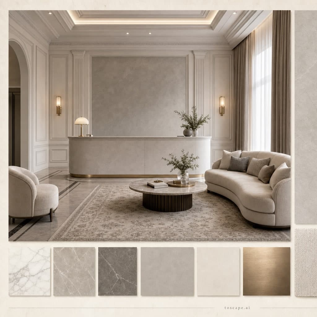
Reception · Neoclassic direction · Cool Neutral palette · Satin finish — the square card version of board 4509 for quick side-by-side comparisons.
Board scorecard
Frequently asked questions
What is the Neoclassic Cool Neutral Reception — Satin moodboard?
Neoclassic Cool Neutral Reception — Satin is a neoclassic interior material moodboard for reception design — one poster pairing the rendered space with its exact surfaces, palette, textiles, and rug.
What materials does this reception moodboard use?
Large-format porcelain carries the main fields while microcement softens the transitions. Porcelain gives you a precise, low-porous surface for high-traffic zones; microcement wraps columns, splashbacks, and joints in one continuous skin, so the two materials meet without heavy trims.
How do you use this board in Toscape?
Open Toscape on Windows, load your own room photo or render, then apply the board through the Interior Design workflow. Keep the poster next to your screen as the reference: match the surface order, palette balance, and finish by eye while the workflow preserves your room's geometry and camera.
Apply this board in Toscape
Use the Neoclassic Cool Neutral Reception — Satin board as your material reference inside the Interior Design workflow — your room geometry stays, the surfaces move toward the board.