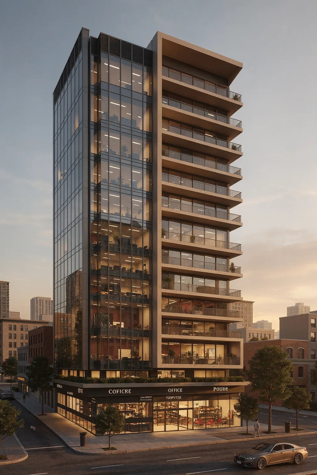
Hybrid Slab-and-Glass Mixed-Use Tower at Urban Corner is an architectural gallery study focused on exterior design, using contemporary minimal, exterior, monolithic volumes to explain the image as a practical reference for facade, massing, material, and spatial decisions.
Stylistically, the project sits in the lineage of late-modern commercial towers, but softened by a more domestic reading of the terrace wing. The sheer glass volume is almost Miesian in its disciplined mullion spacing and uniform floor-to-floor expression, while the slab stack to the east recalls contemporary Mediterranean or Latin American mid-rise housing, where shade-giving overhangs and rail-guarded balconies orchestrate everyday outdoor life. That friction between corporate curtain wall and domestic verandah produces a dual identity, aligning the tower with current tendencies in city infill work that blur live–work typologies rather than strictly zoning them.
The massing strategy is essentially a paired bar composition rotated to hold the street corner: a transparent vertical prism and a more opaque, frame-dominant volume that step together off the commercial base. The corner condition is not chamfered or dramatized; instead, the architects allow the orthogonal grid to meet the intersection crisply, relying on the contrast between volumetric articulation and planar facade to carry the composition. A strong horizontal datum is established just above the retail canopy where planting and a slight setback produce a habitable edge. From there, the office bar rises almost as a single uninterrupted shaft while the slab wing layers balcony after balcony, building a readable massing rhythm that calibrates the skyline presence without resorting to sculptural excess.
Vertically, the structural reading is more implied than explicit, but some cues are present. The glass bar hints at a regular column-and-slab frame behind the curtain wall, yet the continuous vertical mullions visually dominate so the tower reads as a light membrane hung from a rational grid. By contrast, the terrace side foregrounds the horizontal slabs themselves, turning the floor plates into the primary expressive elements; these thickened edges act as both load-bearing signifiers and environmental devices for shade. This horizontal–vertical interplay creates a dialogue of weight and lightness: the glass side seems to float, while the balcony side feels grounded by its stack of plates, almost like a concrete brise-soleil wrapped around inhabitable volume. The facade strategy hinges on differential envelope performance. On the office bar, full-height glazing maximizes visual permeability and office daylighting, mediated by regular horizontal spandrels and narrow verticals that reduce the sense of monolithic glass. Repetitive artificial lighting and glimpses of desks and planting confirm the workspace program. The balcony wing instead deploys a deeper envelope: each level is recessed behind the slab line, with glazed infill set back to create shadow pockets and mitigate solar gain. Simple metal railings preserve openness while the thick outer frame, especially at the roof where it folds into a deep canopy, acts as an environmental visor. Material stratigraphy is restrained but legible—likely a combination of high-performance curtain wall framing, a warm-toned concrete or fiber-cement cladding for the slabs and frames, and a darker soffit finish that reinforces the shadow depth; this remains an inference, but it aligns with the chromatic balance visible in the render. Light and atmosphere are carefully staged through a dusk scenario, which amplifies the contrast between interior luminosity and the heavier, more inert mass of the frame. Long linear ceiling fixtures in the offices create vertical bands of light that climb the facade, visually stitching floors together and broadcasting program to the city. On the balcony side, more sporadic interior lights and silhouetted plants support a reading of individualized units and slower rhythms of occupation. At street level, warm retail lighting spills onto the sidewalk, aided by a low canopy and street trees that temper the hard edge of the corner. Landscaping appears in slender planters just above the plinth and on several balconies, a modest but effective tactic for softening the hinge between hardscape and vertical facade. The whole composition feels contemporary not because of novelty, but because it refines familiar mixed-use tropes into a clear spatial sequence from public sidewalk, through transparent plinth, up to layered private terraces. For this kind of facade and program calibration, especially the negotiation between a fully glazed office bar and a more stereotomic terrace stack, one can see how concept-to-render workflows like those explored on https://www.toscape.ai/ might soon become routine tools for testing envelope depth, daylight behavior, and mixed-use massing scenarios across iterations without losing that essential clarity of architectural intent.
Materials
The material reading is driven by mineral and stone-like tones, using surface depth, shadow, and warm neutral coloration to strengthen the facade's architectural identity.
Style
The style direction reads as contemporary minimal, supported by exterior and monolithic volumes.